ROCK Radio: Unified Brand Architecture
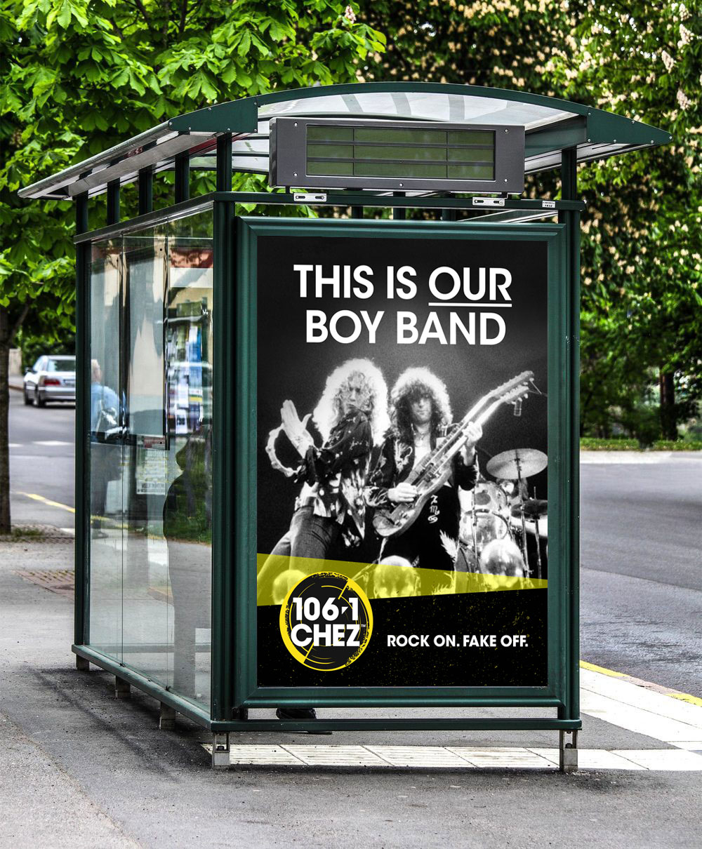
Faced with ten fragmented and visually inconsistent station identities across the national ROCK Radio network, the challenge was to engineer a unified, definitive visual system. The final creative strategy delivered a bold, modern brand architecture that honors the rebellious spirit of contemporary rock while scaling seamlessly across digital content, sub-brands, and national marketing campaigns.
Before entering the exploratory design phase, the process began with exhaustive competitor analysis and market industry reviews to identify whitespace in a crowded audio landscape. Because the ten legacy stations each used entirely different fonts and mismatched colour palettes, I conducted extensive colour theory research to establish a raw, intentionally anarchistic colour system that could visually bridge the entire network under a single, defiant attitude.
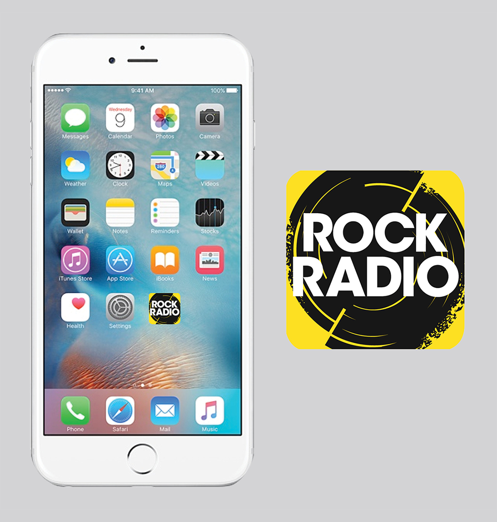
The refreshed identity centers on high-contrast, timeless typography balanced by grunge-inspired graphic elements. The anchor of the visual system is a highly versatile circular carrier shape that evokes both vinyl records and speaker cones, giving the stations a recognizable graphic asset that instantly commands attention on any platform.
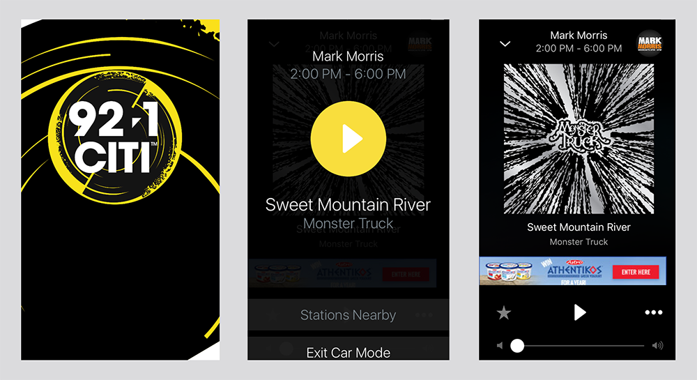
Purpose-built for a digital-first world where radio consumption is increasingly visual, the branding embraces a hard-edged, metaphorical "split." This deliberate break in the circular carrier shape is actually a hidden Easter egg; a concealed lightning bolt cleverly carved into the negative space. This subtle design nod injects an extra layer of raw attitude, authenticity, and discovery for core fans.